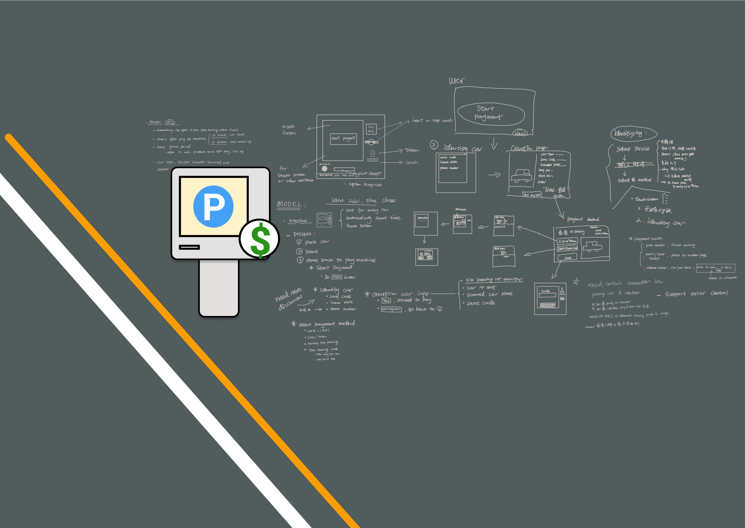
Pay Station Interface
Yay yay I recently got my license! 🥳
However, as I drove around Houston and Boston, I noticed several design inefficiencies in the local uncontrolled parking systems and pay interfaces. As a researcher, I identified this as a challenge and collaborated with my research team in order to find solutions together.
Role: UX Researcher | Timeframe: 1 month | First Year Master’s Team Project
Goal
To find the best solution to design a multi-car surface parking lot pay station for an parking lot that requires no human control while being easy and effective for users to access in the US.
Similarity Analysis
We conducted then applied similar systems analysis to identify user pain points and to learn how current design tackles this challenge.
We learned that uncontrolled parking lots do not limit vehicle access. Users usually start with identification information for their vehicle, they indicate time, then they proceed to payment.
The Problem
1. Unclear Functions for Buttons and Keyboard
Some interfaces have confusing buttons that were designed for multiple functions while some were never used during the paying process.
Buttons use the same color theme and size across different functions.
The button layout has complicated designs and doesn’t provide enough instructions on how to use the buttons.
2. Lack of Solutions for Error Recovery
It is normal to make mistakes, and it is the interface’s responsibility to help users recover from those errors. Users should be able to edit information or to go back to previous pages at any time, but the current experience is unintuitive.
Some interfaces force users to restart the payment process when users input the wrong information.
When typed wrong, some system request users to retype everything instead of editing the specific letter/number.
We noticed design inconsistency in the “Back” button. Either the button was not presenting on the same location for every page or the page didn’t have a “Back” button at all.
3. No Functions for Tracking and Ensuring Payment
Current pay interfaces usually run on a separate system that’s not automatically synced with the parking data, so most systems we looked at required users to pay right after parking to preserve parking revenue. However, it is difficult to track payment or to identify which car has paid.
The worst part? Heavy user workload & lack of user support
Many existing uncontrolled pay interfaces heavily rely on users’ manual input to pay for parking. They assume the user can accurately predict the length of parking or can always remember parking information like the license plate number.
This could lead to more errors and decrease success rate. It also frustrates users and makes them feel punished when they can’t comply with the paying process, such as forgetting their license number or not knowing how long they need to park.
Design Principles
Before going into design detail, we first identified 4 major functions using operational analysis to guide our solutions in the new design:
Identification
The interface recognizes user input and can use that to identify the corresponding parking information.
Parking Time
The interface can calculate total park time and recognize holidays and weekends for free parking.
Payment Methods
The interface supports multiple payment methods to provide a flexible payment process.
Error Recovery
The interface allows users to make errors and also provide effective error corrections.
After pinpointing essential features, our next goal was to come up with solutions to effectively improve the efficiency of the payment process and alleviate user frustration of recalling numbers or predicting uncertainty.
We proposed the main task flow of the payment process to provide us a visual guidance on what function should occur at certain place.
We also conducted a cognitive walkthrough to examine the usability of our design and identify issues and unclearness in the new system.
Solutions
Touch Screen & Digital Keyboard
Users can use the digital keyboard to type in car information or edit the input at any time.
Car Stopper & Automatic Timing Device
To reduce the stress of predicting parking time, we added a car stopper with flap lock for every parking space that responds to commands sent by our pay station interface.
Once the parking starts, the flap lock will rise to lock the car which triggers the automatic timing that synced the data to the interface system.
When users are ready to pay at the interface, the system will terminate timing and present total parking time and fee for the corresponding vehicle. Once payment is done, the car will be unlocked and free to exit.
Technical Car Identification Method
Users expect the pay station to be simple and efficient to interact with, but the current flow makes it difficult to reduce user workload since it heavily relies on user input.
The new design alleviates this stress by pre-documenting car appearance (ie. color) and license plate information using an artificial vision system and monitor system. As a result, the interface can effectively support the user in identify the car.
Color Identification Method
If the user forgot their parking zone code or license plate number, they can use their vehicle colors plus the approximate time they started parking to continue the identification process. The interface will present car images according to the user input and allow users to find their car.


